

Unveiling the Dynamics: A Python Analysis of the Dhaka Stock Market


Table of contents
- Dataset
- Understanding the Analysis Code
- Import the necessary library
- Loading the dataset with pandas
- Convert the 'Date' column in the DataFrame to a DateTime format
- Calculate basic summary statistics for each column (mean, median, standard deviation, etc.)
- Selecting Key Companies from the Stock Market Dataset
- Explore the distribution of the 'Close' prices over time
- Identify and analyze any outliers (if any) in the dataset
- Create a line chart to visualize the 'Close' prices over time
- Calculate and plot the daily percentage change in closing prices
- Investigate the presence of any trends or seasonality in the stock prices
- Apply moving averages to smooth the time series data in 15/30 day intervals against the original graph
- 11.1.Calculate the average closing price for each stock
- Identify the top 5 stocks based on the average closing price
- Identify the bottom 5 stocks based on the average closing price
- Calculate and plot the rolling standard deviation of the 'Close' prices
- Daily price change (Close - Open)
- Analyze the distribution of daily price changes
- Identify days with the largest price increases and decreases
- Identify stocks with unusually high trading volume on certain days
- Explore the relationship between trading volume and volatility
- Correlation matrix between the 'Open' & 'High', 'Low' &'Close' prices
- Heatmap to visualize the correlations using the seaborn package
Welcome to the world of Dhaka stock market analysis! In this blog, we'll delve into the fascinating realm of stock market trends, data analysis, and insights specific to the Dhaka stock market. Through the lens of Python and Jupyter-notebook, we'll uncover valuable information and gain a deeper understanding of the dynamics driving the Dhaka stock market. Join me on this insightful journey as we explore the intricacies of stock market analysis and its implications for investors and enthusiasts alike.
Dataset
Here is the stock market dataset for your analysis:
Feel free to explore this comprehensive dataset to gain valuable insights into the dynamics of the Dhaka stock market.
Understanding the Analysis Code
Let's Explain the code block by block
Import the necessary library
These imported libraries are fundamental for the analysis
numpy: Used for numerical operations and array manipulations.
pandas: Essential for data manipulation and analysis, providing
powerful data structures and tools.
matplotlib.pyplot: Enables the creation of visualizations such as plots, charts, and graphs.
seaborn: A powerful library for statistical data visualization, enhancing the aesthetics and overall appeal of visualizations.
import numpy as np
import pandas as pd
import matplotlib.pyplot as plt
import seaborn as sns
Loading the dataset with pandas
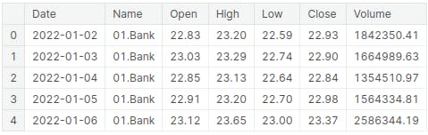
In this section, the stock market data is imported into the Jupyter-notebook using the read_csv() function from the pandas library. Subsequently, the head() function is utilized to display the initial rows of the dataset, offering a glimpse into the structure and contents of the Dhaka stock market data
df = pd.read_csv("../input/stock-market-data/Stock_Market_Data.csv")
df.head()
Convert the 'Date' column in the DataFrame to a DateTime format
This line of code converts the 'Date' column in the stock_data DataFrame to a DateTime format, with the 'dayfirst' parameter set to True. This conversion is essential for time-series analysis and ensures that the date data is interpreted accurately within the analysis.
stock_data['Date'] = pd.to_datetime(stock_data['Date'],dayfirst=True)
Calculate basic summary statistics for each column (mean, median, standard deviation, etc.)
The code computes the summary statistics for the stock_data DataFrame using the describe() function, providing key statistical metrics such as count, mean, standard deviation, and minimum, and maximum values for each numerical column in the dataset.
summ_stat = stock_data.describe()
summ_stat

Selecting Key Companies from the Stock Market Dataset
With so many companies in the dataset, I'll handpick a selection to dive into. This way, we can really get to know these companies and understand their impact on the market as a whole. You can find all the company names with this code.
df['Name'].unique()I have selected five companies below.
 ## randomly select 5 company
 unique_names = ['01.Bank', '02.Cement', '03.Ceramics_Sector', '04.Engineering',
        '05.Financial_Institutions']
Explore the distribution of the 'Close' prices over time
This code iterates through unique company names in the dataset, creates individual data for each company, and then generates a histogram of the closing prices over time for each company. It will show a total of 5 companies. two of them are given below The resulting visualizations offer a clear depiction of the distribution of close prices for the selected companies, enabling a comparative analysis of their stock performance.
for name in unique_names:
    company_data = stock_data[stock_data['Name'] == name]
    plt.figure(figsize=(15,5))
    sns.histplot(data=company_data ,x="Close",bins=30,label=name)
    plt.xlabel("Closing Price Distribution")
    plt.ylabel("Frequency")
    plt.title("Distribution of Close Prices Over Time of {}".format(name))
    plt.legend()
    plt.xticks(rotation=45)
    plt.show()


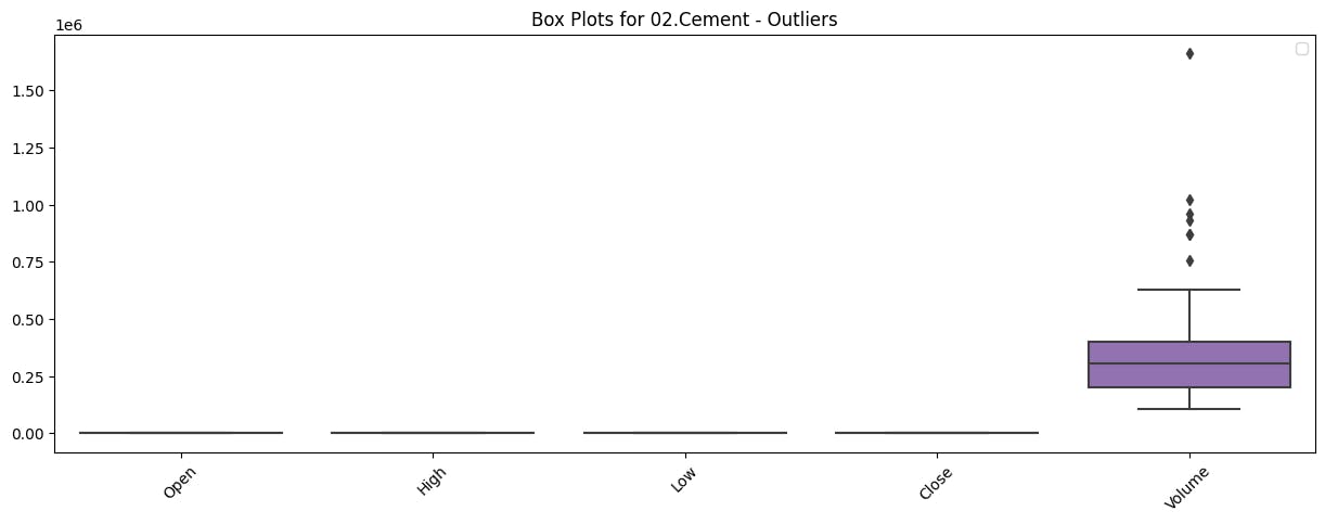
Identify and analyze any outliers (if any) in the dataset
This code iterates through unique company names in the dataset, creates individual data for each company, and then generates box plots to visualize the distribution of numerical variables, showcasing any potential outliers for each company. These visualizations provide valuable insights into the spread and potential anomalies within the data for the selected companies.
for name in unique_names:
    company_data = stock_data[stock_data['Name']==name]
    plt.figure(figsize=(15,5))
    sns.boxplot(data=company_data.select_dtypes(include=np.number))
    plt.title(f'Box Plots for {name} - Outliers')
    plt.legend()
    plt.xticks(rotation=45)
    plt.show()
Output (2 out of 5)

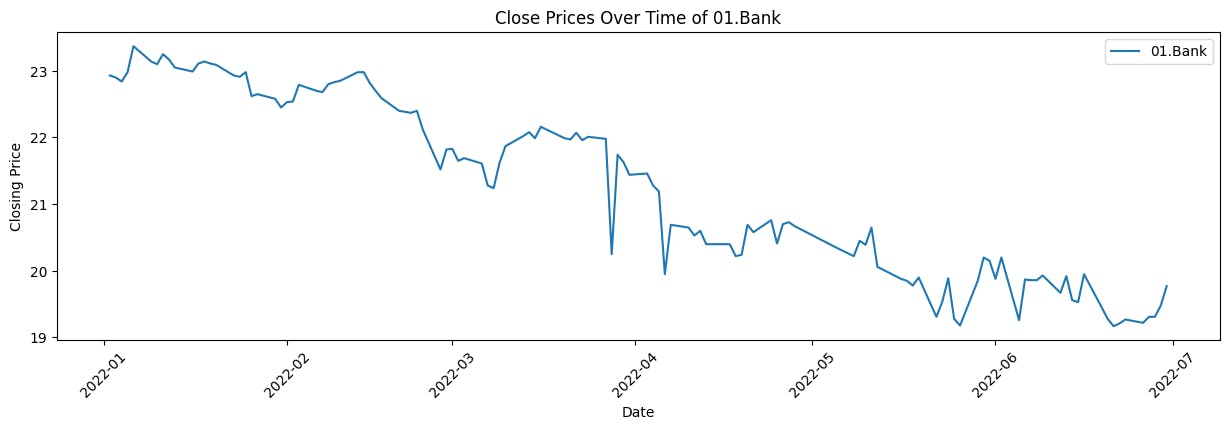
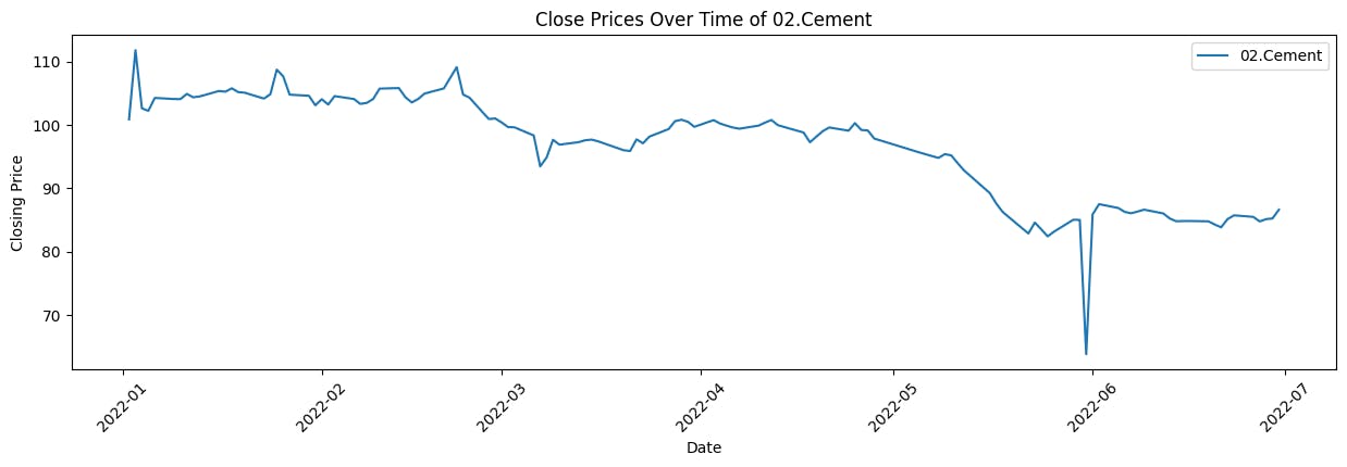
Create a line chart to visualize the 'Close' prices over time
This code iterates through unique company names in the dataset, creates individual data for each company, and then generates line plots to visualize the trend of closing prices over time for each company. These visualizations offer a clear representation of how the closing prices have evolved for the selected companies, providing insights into their historical performance.
for name in unique_names:
    company_data = stock_data[stock_data['Name'] == name]
    plt.figure(figsize=(15, 4))
    plt.plot(company_data['Date'],company_data['Close'],label ="{}".format(name))
    plt.xlabel('Date')
    plt.ylabel('Closing Price')
    plt.title('Close Prices Over Time of {}'.format(name))
    plt.legend()
    plt.xticks(rotation=45)
    plt.show()
Output (2 out of 5)
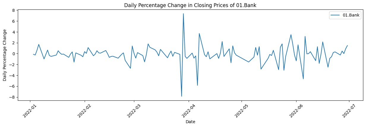
Calculate and plot the daily percentage change in closing prices
This code iterates through unique company names in the dataset, calculates the daily percentage change in closing prices for each company, and then generates line plots to visualize these changes over time. These visualizations offer insights into the daily fluctuations in closing prices for the selected companies, aiding in the assessment of their market volatility and performance.
for name in unique_names:
    plt.figure(figsize=(15, 4))
    company_data = stock_data[stock_data['Name'] == name]
    company_data['Daily_PCT_Change'] = company_data['Close'].pct_change() * 100
    plt.plot(company_data['Date'], company_data['Daily_PCT_Change'], label=name)
    plt.xlabel('Date')
    plt.ylabel('Daily Percentage Change')
    plt.title('Daily Percentage Change in Closing Prices of {}'.format(name))
    plt.legend()
    plt.xticks(rotation=45)
    plt.show()
Output (2 out of 5)

Investigate the presence of any trends or seasonality in the stock prices
This code iterates through unique company names in the dataset, plots the closing prices over time for each company, and overlays a rolling average (e.g., 30 days) to visualize the trend. These visualizations provide insights into both the daily fluctuations and the long-term trends in closing prices for the selected companies, aiding in the assessment of their stock performance.
for name in unique_names:
    company_data = stock_data[stock_data['Name'] == name]
    plt.plot(company_data['Date'],company_data['Close'], label=name)
    # Plotting a rolling average (e.g., 30 days) for trend visualization
    rolling_avg = company_data['Close'].rolling(window=30).mean()
    plt.plot(company_data['Date'],rolling_avg, label=f'{name} - Trend Line', linestyle='--')
    plt.title('Stock Prices Trend Line Over Time')
    plt.xlabel('Date')
    plt.ylabel('Closing Price')
    plt.legend()
    plt.show()
Output (2 out of 5)


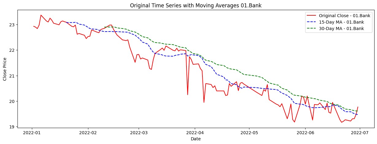
Apply moving averages to smooth the time series data in 15/30 day intervals against the original graph
This code iterates through unique company names in the dataset, calculates the 15-day and 30-day moving averages for each company's closing prices, and then generates visualizations to compare the original closing prices with their respective moving averages over time. These visualizations offer insights into the trend and direction of the stock prices for the selected companies, aiding in the analysis of their historical performance.
for name in unique_names:
    plt.figure(figsize=(15, 5))
    company_data = stock_data[stock_data['Name'] == name]
    company_data['15_Day_MA'] = company_data['Close'].rolling(window=15).mean()
    company_data['30_Day_MA'] = company_data['Close'].rolling(window=30).mean()

    # Plotting for the current company
    plt.plot(company_data['Date'], company_data['Close'], label=f'Original Close - {name}',color="red")
    plt.plot(company_data['Date'], company_data['15_Day_MA'], label=f'15-Day MA - {name}', linestyle='--',color="blue")
    plt.plot(company_data['Date'], company_data['30_Day_MA'], label=f'30-Day MA - {name}', linestyle='--',color="green")
    plt.xlabel('Date')
    plt.ylabel('Close Price')
    plt.title('Original Time Series with Moving Averages {}'.format(name))
    plt.legend()
    plt.show()
Output (2 out of 5)

11.1.Calculate the average closing price for each stock
The code creates a new DataFrame, 'df', by calculating the average closing price for each company from the 'stock_data' DataFrame using the 'groupby()' function. The resulting DataFrame contains two columns: 'Name' and 'AvgClosingPrice', displaying the average closing price for each company.
df = pd.DataFrame(stock_data.groupby('Name')['Close'].mean()).reset_index()
df.columns=['Name','AvgClosingPrice']
df.head()

Identify the top 5 stocks based on the average closing price
df_sorted = df.sort_values(by='AvgClosingPrice',ascending=False)
top5 = df_sorted.head(5)
top5
Identify the bottom 5 stocks based on the average closing price
df_sorted = df.sort_values(by='AvgClosingPrice',ascending=False)
bottom5 = df_sorted.tail(5)
bottom5
Calculate and plot the rolling standard deviation of the 'Close' prices
The code iterates through unique company names, retrieves stock data for each company, and creates a plot showing the rolling standard deviation of their closing prices over time using a 30-day window. This visualization helps compare the volatility of stock prices among different companies.
for name in unique_names:
    company_data = stock_data[stock_data['Name'] == name]
    plt.figure(figsize=(15, 8))
    rolling_std = company_data['Close'].rolling(window=30).std()
    plt.plot(company_data['Date'],rolling_std, label=f'Rolling Std (30 days) - {name}',linestyle='--',color="blue")
    plt.xlabel('Date')
    plt.ylabel('Rolling Standard Deviation')
    plt.title('Rolling Standard Deviation of Close Prices for Each Company')
    plt.legend()
    plt.xticks(rotation=45)
    plt.show()
Output(2 out of 5)


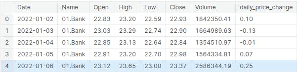
Daily price change (Close - Open)
stock_data['daily_price_change'] = stock_data['Close'] - stock_data['Open']
stock_data.head()
Analyze the distribution of daily price changes
This code iterates through unique company names, retrieves stock data for each company, and creates a histogram showing the distribution of daily price changes over time for each company. The Seaborn library is used to generate the histograms, with each company's data represented by a different color. The visualization provides an overview of the frequency and distribution of daily price changes for each company.
for name in unique_names:
    company_data = stock_data[stock_data['Name'] == name]
    sns.histplot(data=company_data, x='daily_price_change', bins=30, label=name)
    plt.xlabel('Daily Price Chnage')
    plt.ylabel('Frequency')
    plt.title('Distribution of Daily Price Chnage Over Time {}'.format(name))
    plt.legend()
    plt.show()
Output(2 out of 5)


Identify days with the largest price increases and decreases
sorted_data = stock_data.sort_values("daily_price_change",ascending=False)
largest_price_increase = sorted_data.head(1)
largest_price_increase
sorted_data = stock_data.sort_values("daily_price_change",ascending=False)
largest_price_decrease = sorted_data.tail(1)
largest_price_decrease
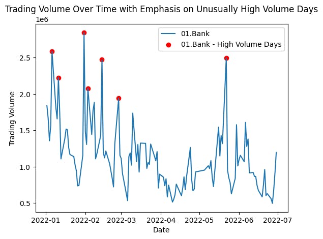
Identify stocks with unusually high trading volume on certain days
This code iterates through unique company names, retrieves stock data for each company, and creates a plot showing the trading volume over time. It also highlights unusually high volume days with red markers. The visualization aims to emphasize and compare the trading volume patterns for different companies, particularly focusing on days with exceptionally high trading volume
for name in unique_names:
    company_data = stock_data[stock_data['Name'] == name]
    plt.plot(company_data['Date'],company_data['Volume'],label=name)
    threshold = company_data['Volume'].quantile(0.95)
    high_volume_data = company_data[company_data['Volume'] > threshold]
    plt.scatter(high_volume_data['Date'],high_volume_data['Volume'],color="red",marker='o',label="{} - High Volume Days".format(name))
    plt.title('Trading Volume Over Time with Emphasis on Unusually High Volume Days')
    plt.xlabel('Date')
    plt.ylabel('Trading Volume')
    plt.legend()
    plt.show()
Output (2 out of 5)

Explore the relationship between trading volume and volatility
This code calculates the volatility of stock prices and creates a correlation heatmap for each company. It first calculates the volatility as the percentage change in closing prices and then computes the correlation between volume and volatility for each company. Subsequently, it generates a series of correlation heatmaps, one for each company, to visualize the relationship between trading volume and stock price volatility.
stock_data['Volatility'] = stock_data.groupby("Name")['Close'].pct_change()
correlation_matrix = stock_data.groupby("Name")[['Volume','Volatility']].corr()
for name in unique_names:
    plt.figure(figsize=(4,4))
    sns.heatmap(correlation_matrix.loc[name],annot=True)
    plt.title("Correlation Heatmap of {}".format(name))
    plt.show()
Output (2 out of 5)


Correlation matrix between the 'Open' & 'High', 'Low' &'Close' prices
price_columns = ['Open', 'High', 'Low', 'Close']

# Group by 'Name' and calculate the correlation matrix for each group
correlation_matrices = stock_data.groupby('Name')[price_columns].corr()
for name in unique_names:
    print("Company Name : {}".format(name))
    print("-"*50)
    print(correlation_matrices.loc[name])
    print("-"*50)
Heatmap to visualize the correlations using the seaborn package
for name in unique_names:
    plt.figure(figsize=(4,4))
    sns.heatmap(correlation_matrices.loc[name],annot=True)
    plt.title("Correlation Heatmap of {}".format(name))
    plt.show()
Output(2 out of 5)

